.png)

Netball Singapore had built the country's most significant international netball event. But the identity had not kept up.
What should have felt like a flagship moment looked like every other sports tournament: interchangeable graphics, borrowed conventions, nothing that said Singapore or said something worth saying. The brief was to close that gap. The real question was why it existed at all.
We started by asking what the Nations Cup was actually for. Not the functional answer, international competition, community engagement, but the deeper one. What we found was a tournament built on a specific premise: individual nations, distinct in their own right, coming together to produce something greater than any of them alone.
That idea needed to be the identity, not just the occasion.
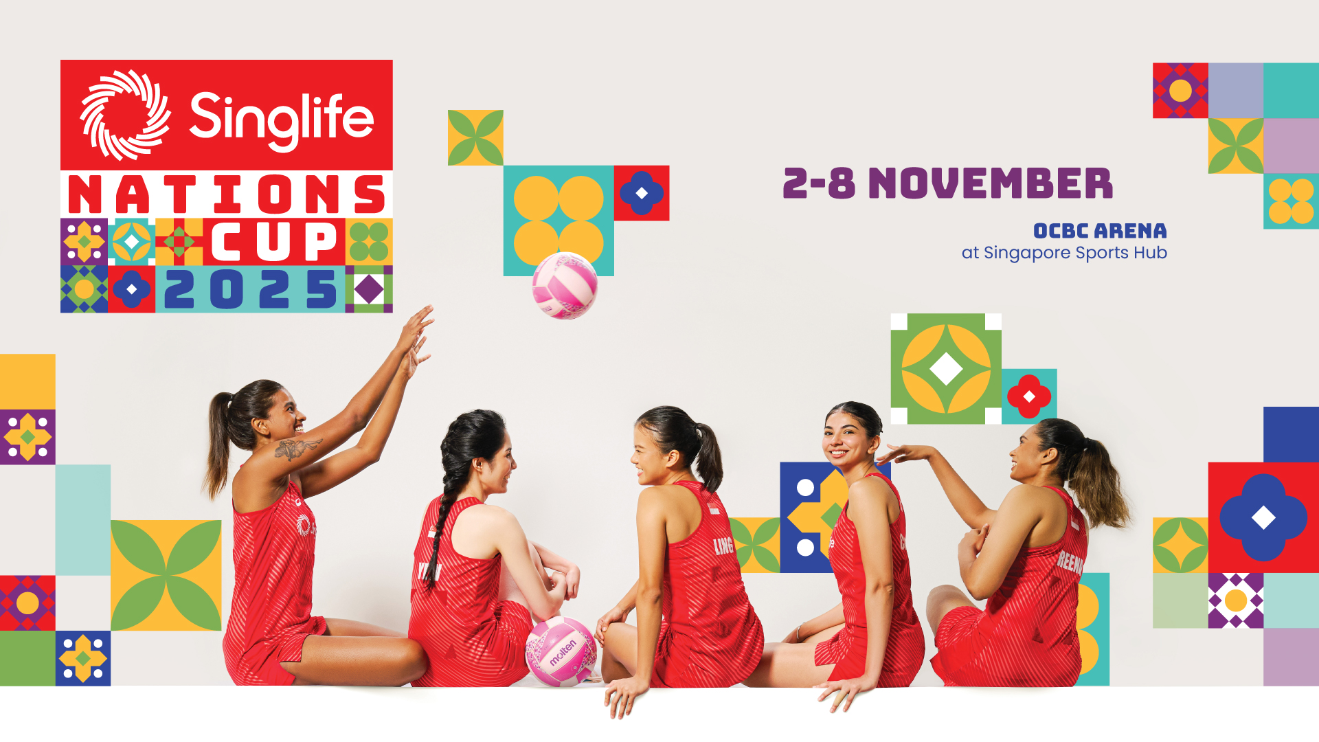
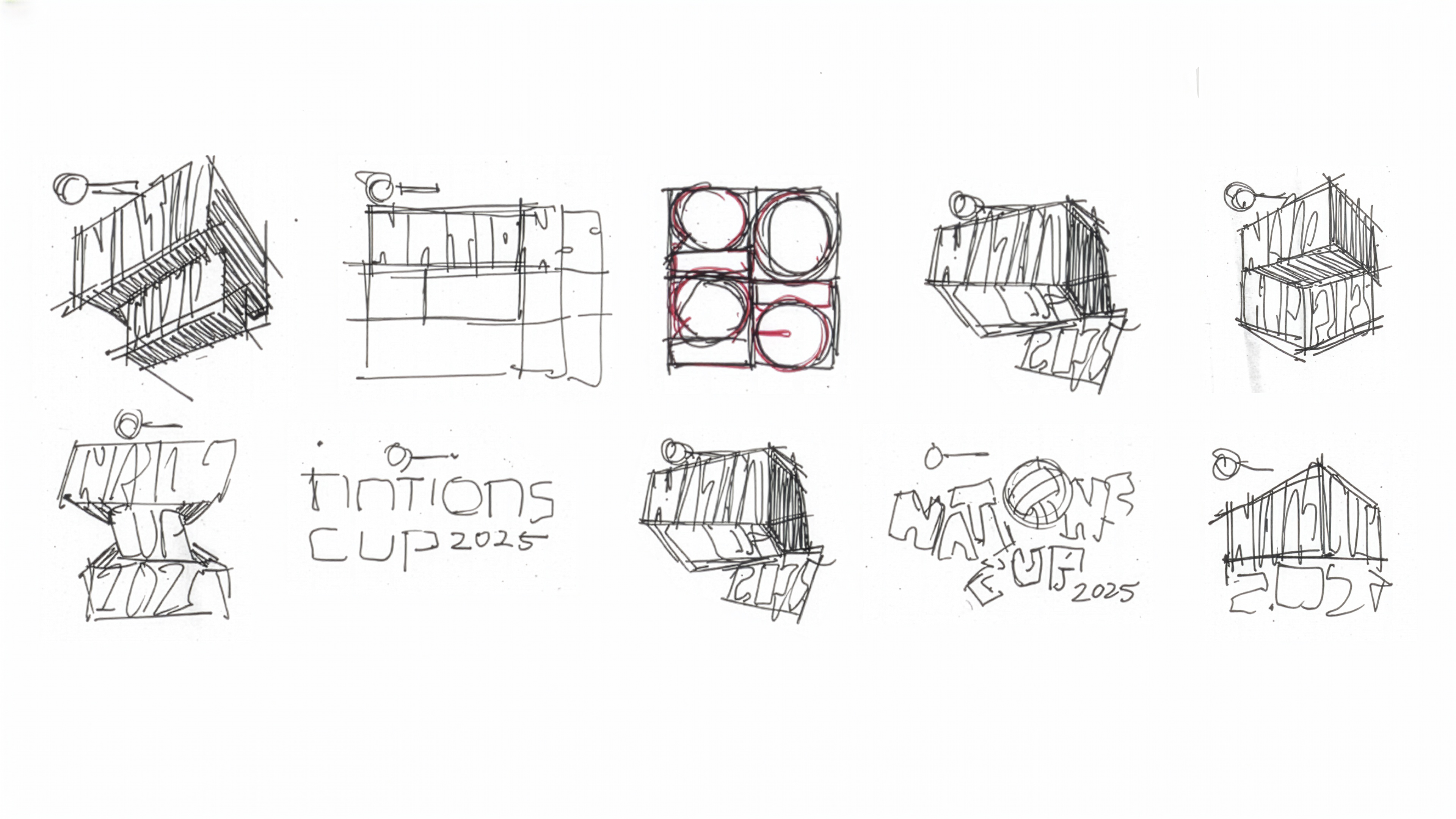
Peranakan tilework gave us the structural argument. Not because it looks Singaporean, though it does, but because the underlying logic of the tile is exactly the logic of the event. A single repeating geometric unit that becomes richer and more complex in combination. We did not reproduce the motifs. We reinterpreted their geometry through a contemporary composition and a controlled colour system. The result reads as unmistakably local to those who know it, and as confidently designed to those who do not.
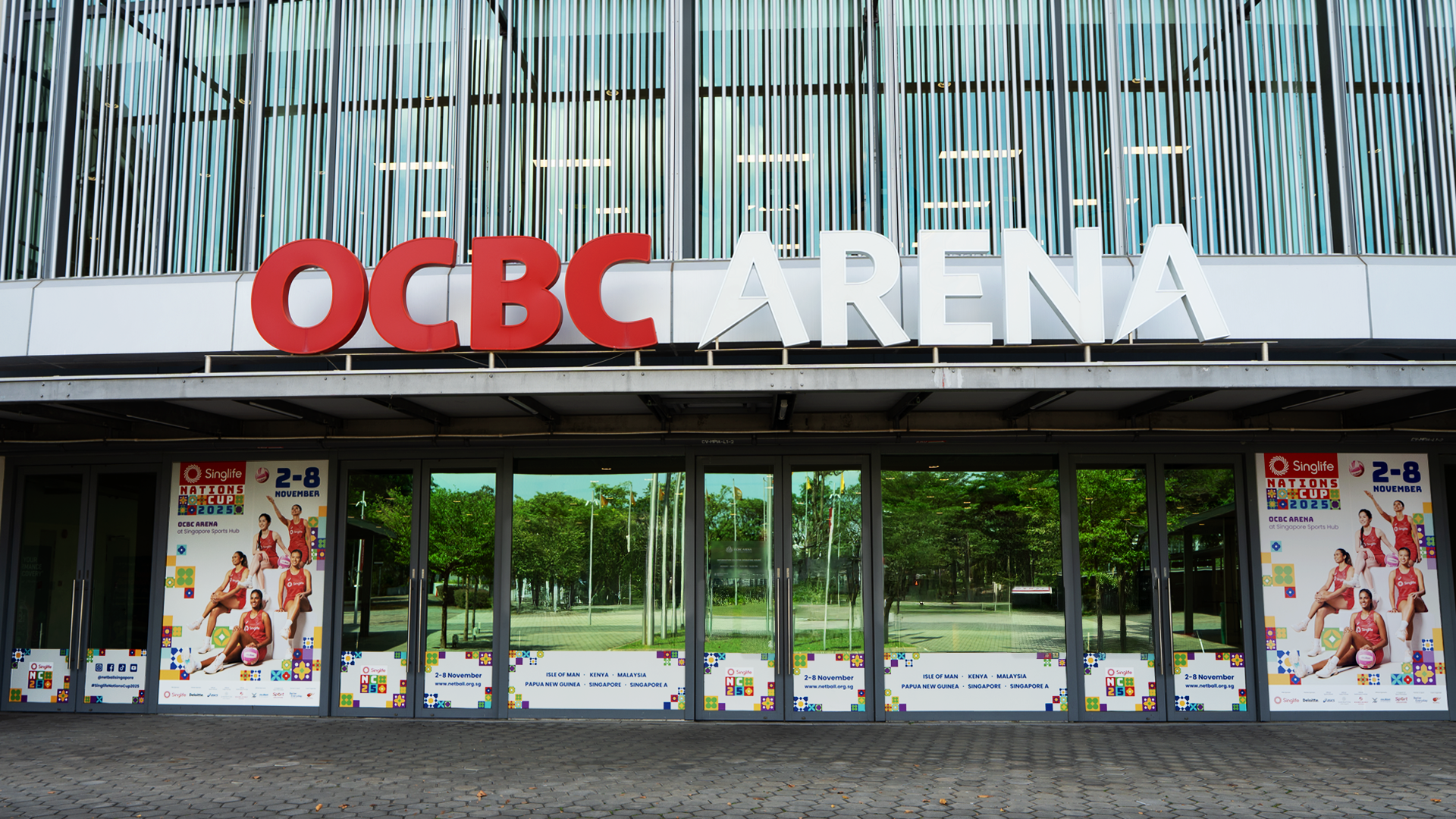
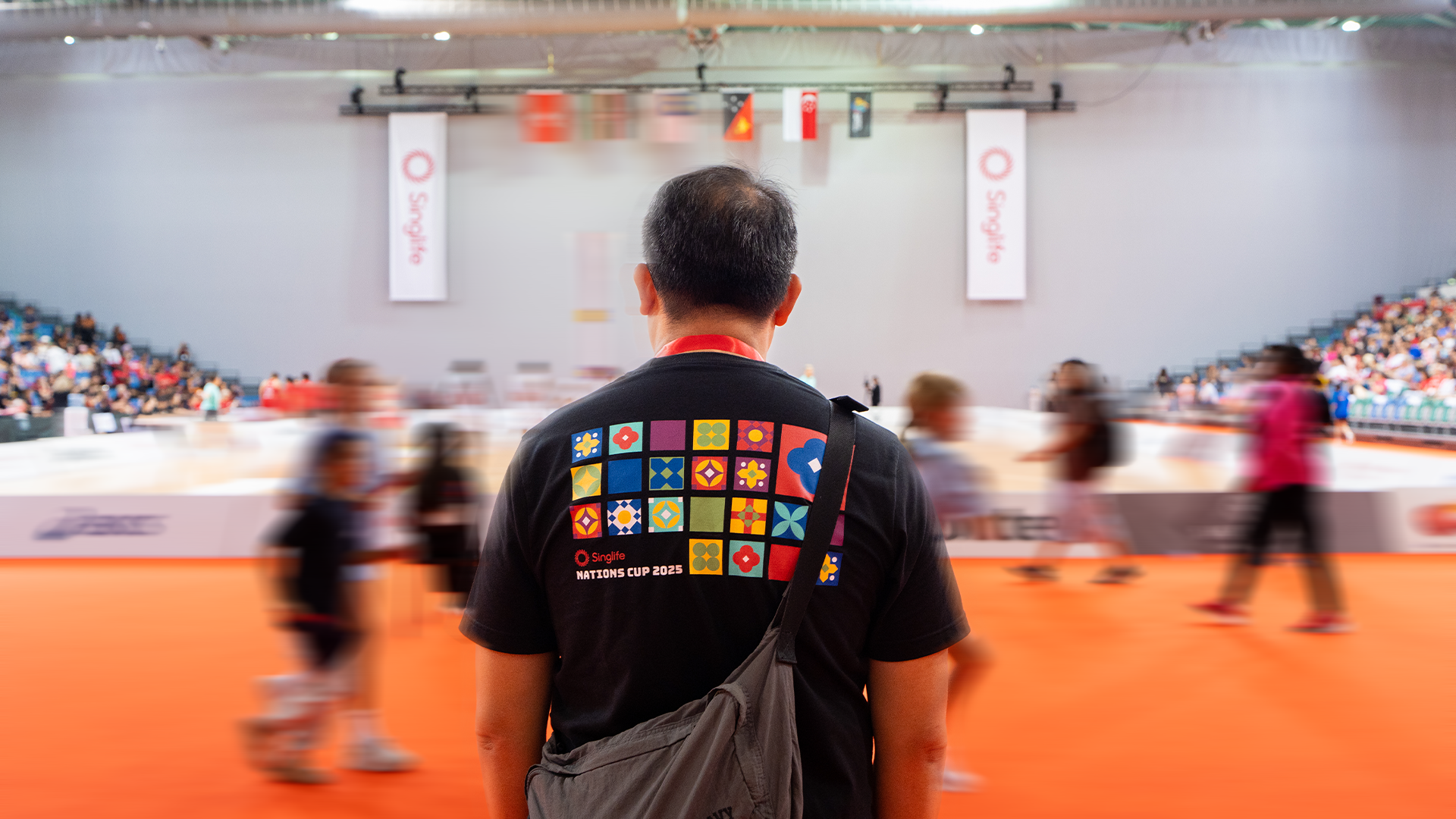
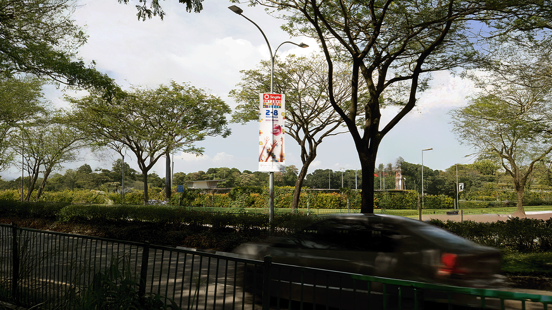
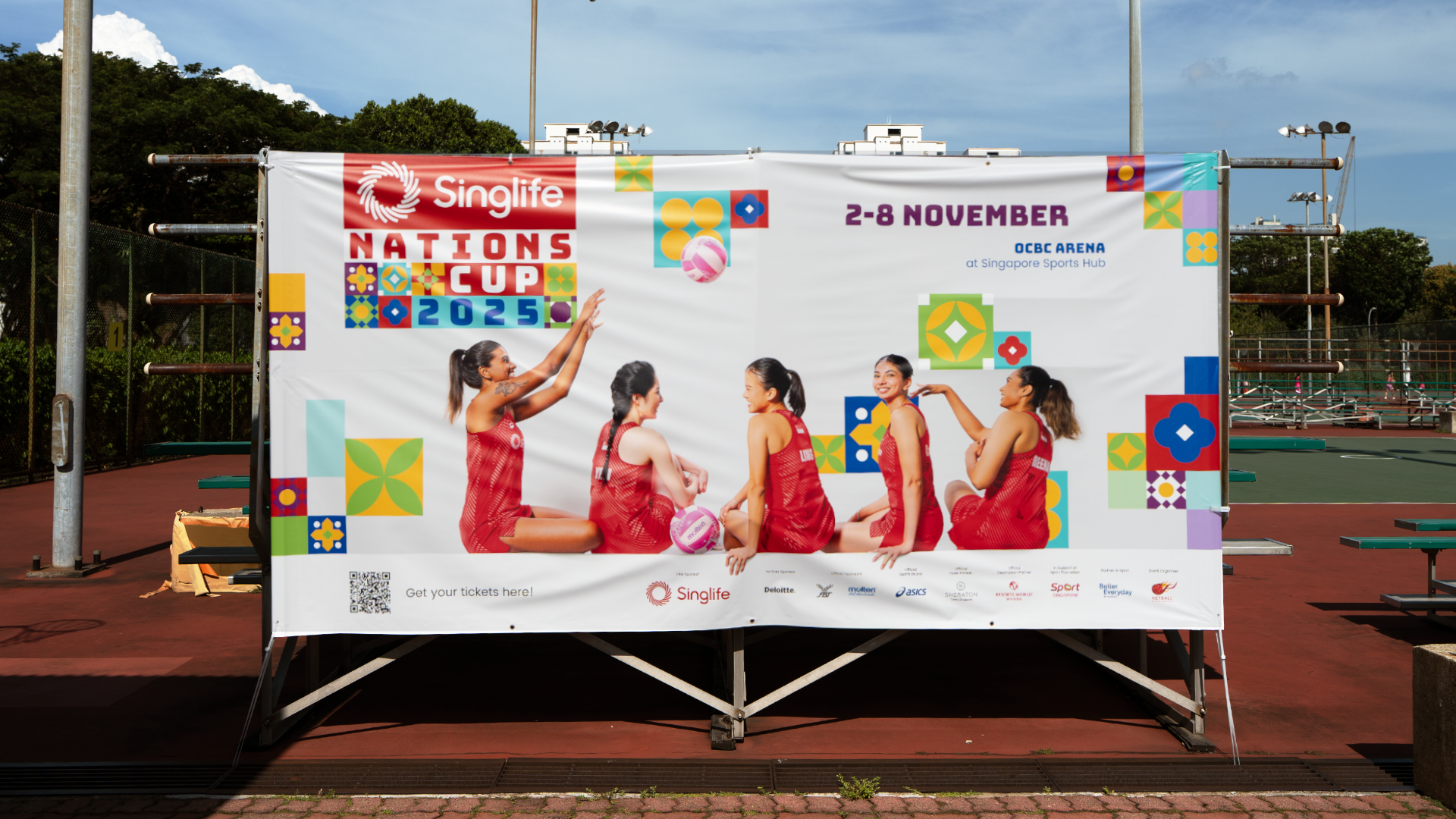
Every element was stress-tested across the full range of applications before anything was finalised. An event identity lives and dies in execution. From a 20-metre LED panel at OCBC Arena to an A6 fan card, the system held.
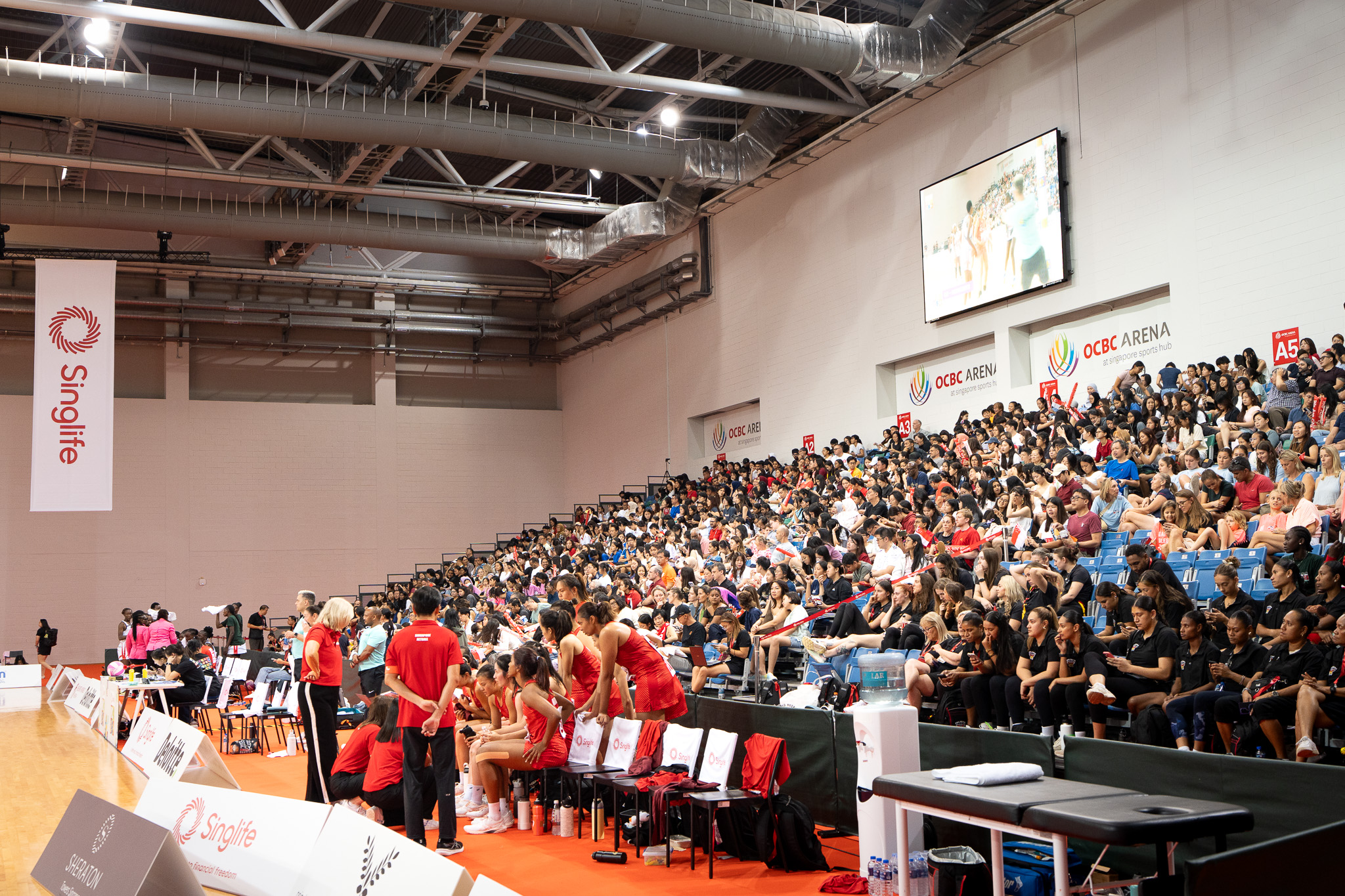
The true measure of an event identity is not the design review. It is match day. Attendance grew 33% over previous years, from 9,000 to 12,000 attendees. Younger audiences who had never engaged with the tournament before were sharing and reacting to the identity on social media before the first game was played. Stakeholders who had been to every previous edition said this year felt different. Not just visually. The energy in the venue, the crowd, the atmosphere. Something had shifted. The Nations Cup finally looked like what it was, and people showed up accordingly.
.gif)

_3%20(1).gif)